UX/UI DESIGN
MOBILE SITE USER EVALUATION AND RE-DESIGN
Background
From 2012 to 2014, Zumiez ran a mobile friendly site designed to provide an optimized shopping experience for mobile devices. The conversion rate was 4x higher on their regular site that on the mobile site. Zumiez dismissed the mobile site, directing that traffic to their regular HTML site. The conversion rate doubled overnight. This suggested that users preferred something about the HTML experience. Recently Google began penalizing Zumiez search results for their lack of a mobile friendly site.

Purpose
Through this process I needed identify why users preferred the HTML site and implement that into a mobile site. This will increase their current mobile conversion rate and bring an end to Google penalizing Zumiez for a non-responsive site.
Research
Before getting started on the design process much research had to be done. This way we could design according to the solution pertaining to the problem.
Target Research
Zumiez targets to young men and women who want to express their individuality through the fashion, music, art and culture of action sports, street wear, and other unique lifestyles.
Discovered
Throughout the process of solving the problem at hand we had to make sure we kept the following in mind for their target audience:
- Parents don’t like to have to log in to buy
- Kids want to be individual while belonging
- Parents are the main ones to shop online
- It isn’t cool to advertise to parents
- Kids want what’s new NOW
- Not many like to download apps
Several of these points were learned through the information that the Zumiez team provided. As we brainstormed in the class we discovered other of the above points that were helpful in the design process.
Mobile Sites
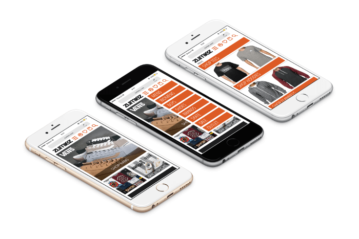
Above are few mobile site that are working well. They have big buttons, making them easy to access for the user. To avoid a clutter near the top they have all implemented the menu option near the top left.
Focus
In addition to our work on creating a mobile friendly site that Google would approve of, we also focused on having a clean design and bridging the gap between parent and child in a way that Zumiez did not have to advertise to the parent. This addition to our focus came from our usability testing. We optimized the current wishlist making it resemble that of a registry list. The kid could add to their list and send the parent a link. The parent could then access the list without the hassle of having to log into an account. The parent is able to buy online directly from that list while increasing the conversion rate. All of this was designed with the mobile dimensions in mind.
Usability Tests
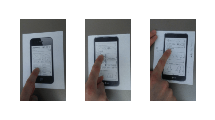
Once the research was done designing came into play. Lo-fi prototypes are fast and easy to start user testing in order to work out the bugs before going into a more defined digital design. Getting Started In the beginning of the project we were all on our own working to find a solution to the problem. I quickly found some things that needed to change through usability testing.
- Too many buttons on homepage is overwhelming
- Users like bigger images when shopping online
- Many didn’t know what drop-down menus were for
Menu Changes
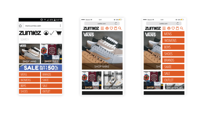
The menu was changed from being displayed first thing (round 1) to being compressed at the top of the page. When user taps the menu icon the option appear in order to select desired category.
Search Bar Changes
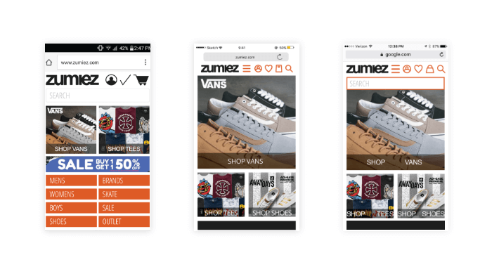
In order to allow more space for bigger images and other content the search bar was removed. It is accessible through the top when tapping on the magnifying glass icon.
Heading Changes
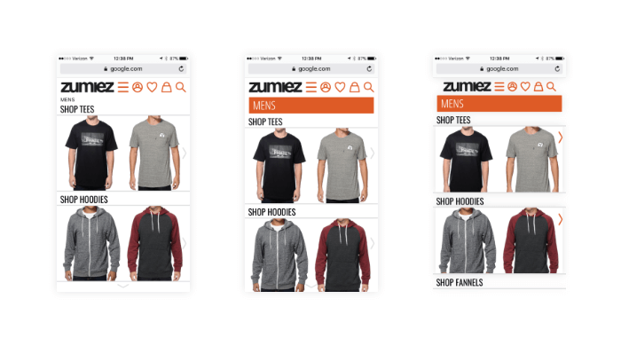
Users mentioned that mens page seemed like a different website. Orange bar for mens was added to keep same feel throughout for a better user experience. A problem arose with this change. Many seemed to think the bar was a button and did not realize “SHOP TEES” and other shop option were in fact their options for selection. Another change would need to be made in future renditions.
Drop Down Menu Changes
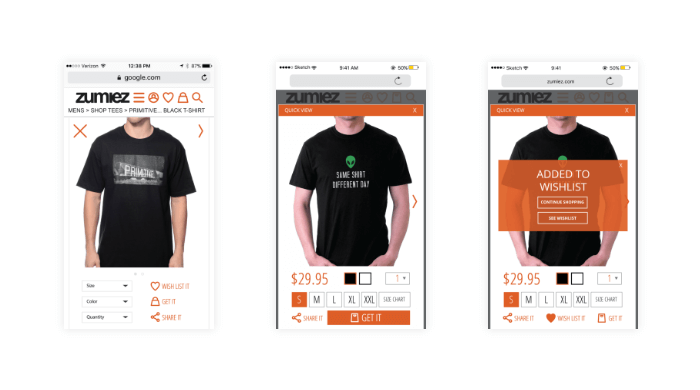
Through user testing we found that the drop down menus were a bit too small and did not stand out to user for selection. The buttons were made more visible by enlarging them and changing the font color to orange. Once an item has been added to the wishlist there needed to be way to differentiate it. A large heart was added to help with this issue.
Shopping Changes
We found that users do not like to wait for another page to load. To combat that a quick-view was added where it would simple be a pop up screen without having to wait and be directed to another page. The quick-view has all the needed information and options available for an online buyer. Drop down menus were changed to buttons for easy selection and fewer taps needed from the user.
Conclusion
As we combined all the research gathered through usability testing, surveys and meeting with Zumiez we were able to address why users preferred the HTML site over the mobile version. We were also able to help bridge the gap between parent and child without the need to advertise to the parent. Navigation, button and image sizes were improved. The wishlist was optimized for a smoother checkout and pickup process for both the parent, who would be purchasing, and the child who would be picking up the product.)
