UX/UI DESIGN | BRAND DESIGN
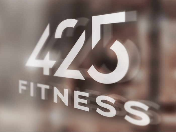
425 FITNESS REBRANDING AND WEBSITE DESIGN

Background
Three former Gold’s Gym clubs in Bothell, Redmond & Issaquah, branched off to form new brand, 425 Fitness. They were now in need of a logo, website and interior design feel (colors, images and signage). The new site was to improve user experience and highlight relevant local information.
Competitive Analysis & Direction
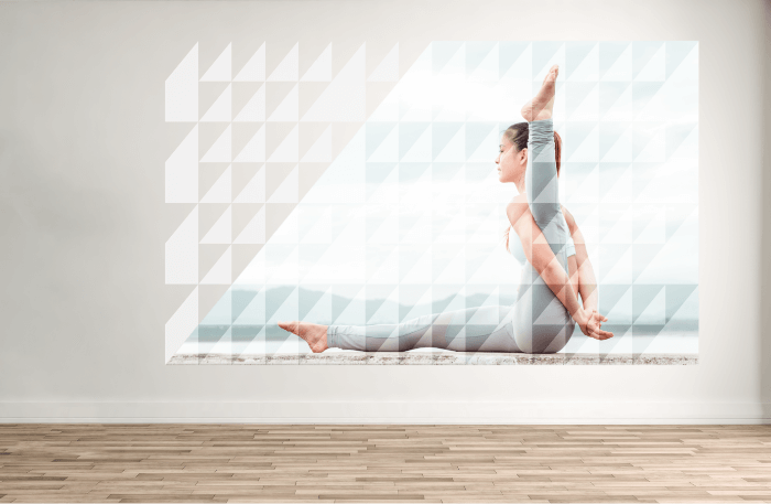
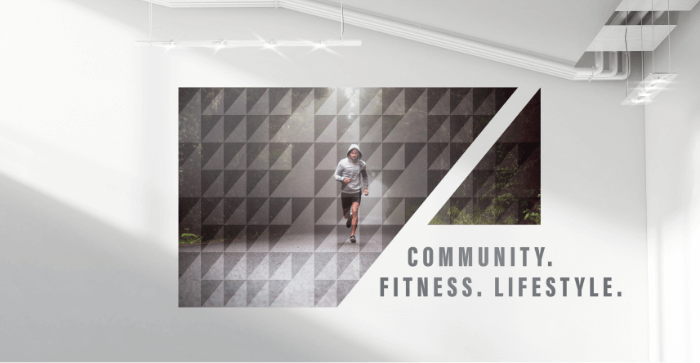
We recommended taking 425 Fitness in more of a local gym direction since they’re not trying to be national right now. 425 Fitness’ prices are on the higher side for a gym, so it makes sense to show off why it is more premium than signing up for a gym like 24-hour fitness. The direction for the overall brand is premium product, light and modern design.

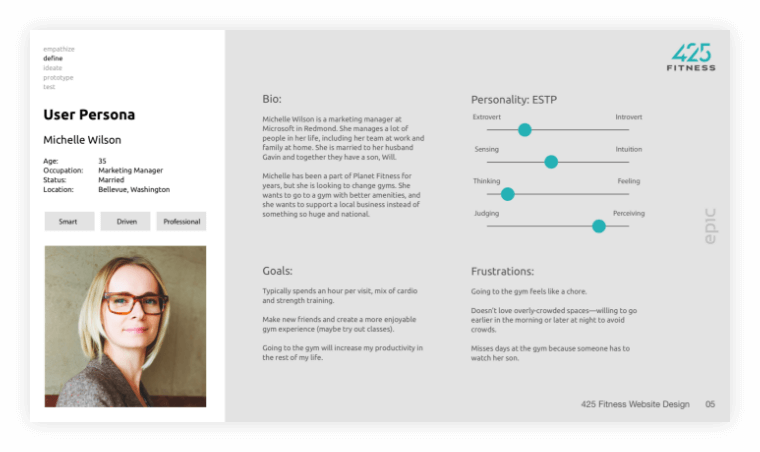
User Persona
Web Style Guide

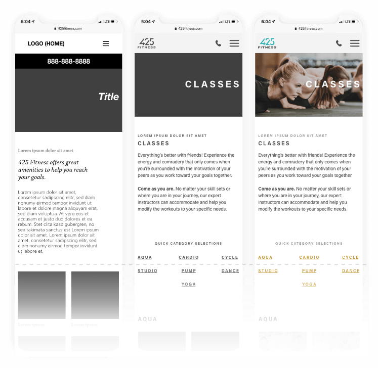
Wireframes
Final Screens 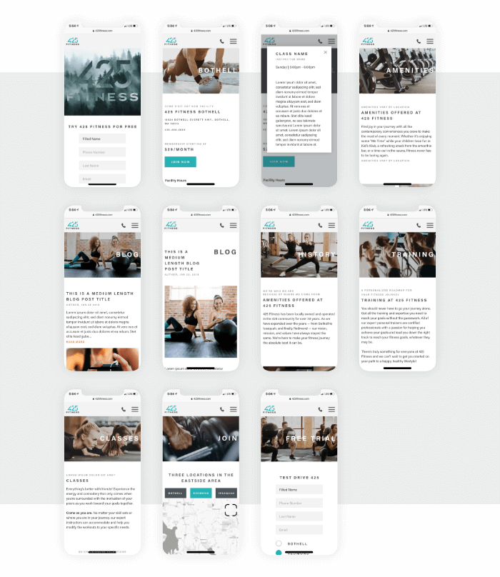
Photographic Style


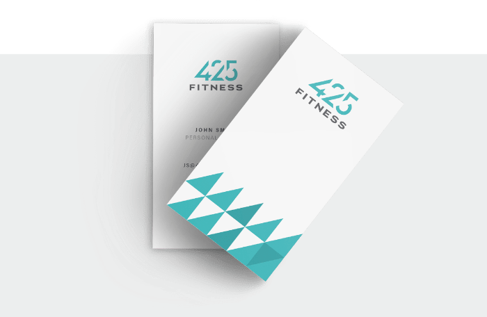
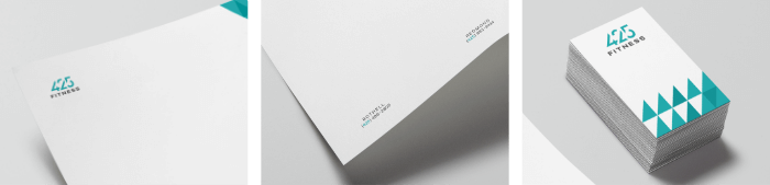
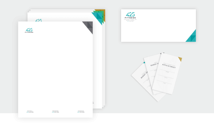
425 Fitness Branding
![]()
These colors were chosen to reflect the locale of 425 Fitness and the natural colors of the Pacific Northwest, slate gray skies, blue waters, and green nature. They invite the outdoors in and enhance the surrounding views.

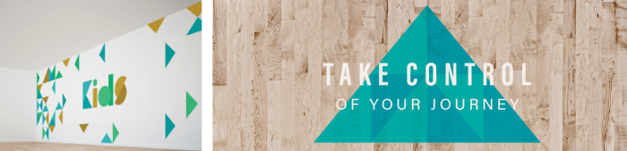
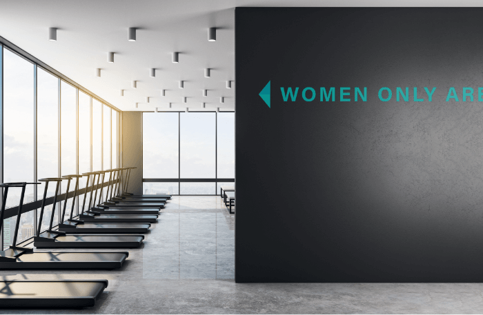
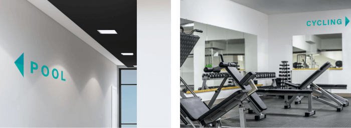
Environmental Design